As promised, here's a first look at the new felt colors that I got last week. One thing that I've struggled with and that the darker gray background hasn't worked so well against is black and white pieces. So I pulled out one that I needed to rephotograph and shot it with all three backgrounds.
Even though the light box poster board is white, I wanted to get a white felt, especially for my modeling shots. The poster board has gotten a few little scratches and whatnot over time that don't look so great in photos. Obviously I still haven't mastered the lighting for white backgrounds, which is why I started using gray a while back. But the white will still serve its purpose for a few particular types of shots.
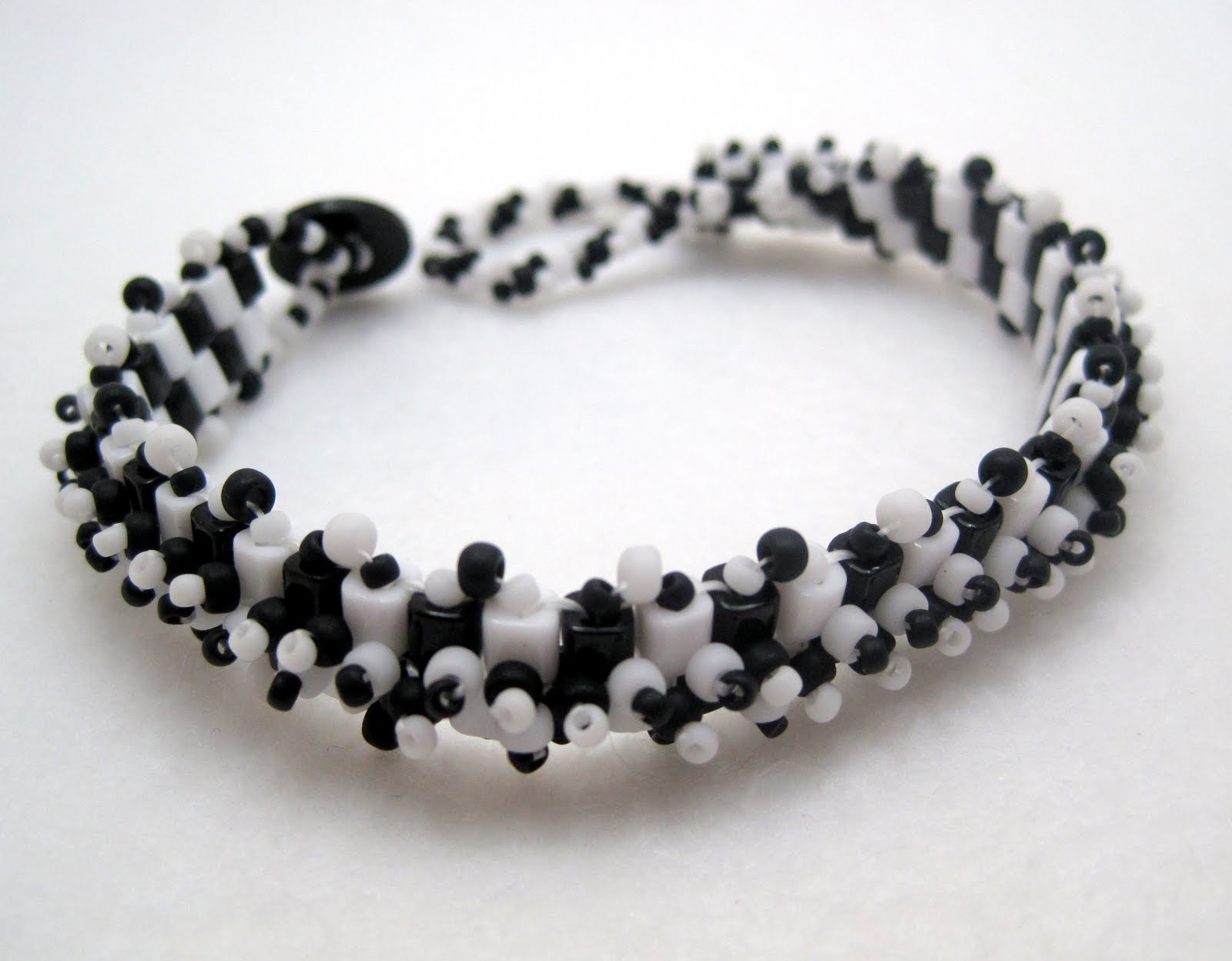
I've been wanting to try a lighter gray for a while and am really pleased with this result. It works wonderfully with the black and white. I think it has potential for a lot of other color combinations, too. The light settings were very easy to manage, even more so than the darker gray. I ended up doing most of the re-shoot for this piece against this background.
I still have to play with this light balance, but I think that this has some potential, too, especially for black and white. I wouldn't use it for a first listing photo. However, it would work well for one or two photos further down in a listing.
While I'm sharing my new backgrounds, I'll share one of my not so successful attempts with the new light gray.
This is one of my new herringbone bracelets. I have several more in the works and am going to launch the line for 2012, so there isn't any hurry on these photos. It doesn't look too bad against the gray as a larger photo, but the gray thumbnail is terrible. The white and dark gray wash the colors out completely, and the blue blends right in with the blue in the bracelet so I'm at a loss.
I had the same problem with this pastel blue bracelet back in the spring (which as a result, I still haven't listed).
Some colors are just really really tough to photograph. Regardless, I'm still happy with my new felt squares. You'll be seeing the light gray frequently in the near future.


The light grey with the black and white (2nd photo) works well.
ReplyDeleteBeautiful braceletas!
ReplyDeleteI'm loving that light grey felt background. So cute. And your new styles of bracelets are lovely!
ReplyDeleteI love that grey background. You'll just have to leave these felt pieces packed up somewhere. Mine get so dirty when they're used! {:-D
ReplyDeleteI started using the light grey back ground also, for almost everything. I read somewhere its is the best background to use. Instead of felt, because I don't want the felt texture to be seen, I buy 12x12 pieces of scrapbooking paper. That way I can try out various shades with out to much expense. Another thing I started doing that is working very well (and I don't know where I saw this suggested)is to purchase a few pieces of the plain white vellum. Just putting the piece of vellum, with it's smooth surface really makes a nice background. You can do this with colored backgrounds also, just place the vellum over the back ground paper. Sometimes you might need 2 vellum sheets to tone it down if the color is very bright!
ReplyDeletethey're all very nice - you have talent
ReplyDeleteAgreed on the light grey. Have you tried black for some of the harder jewelry colors to photograph?
ReplyDeleteHmm... I may have to get some black felt for taking photographs of my white pieces. I shoot almost everything on white foam core because it's super easy to adjust the lighting in Photoshop when the background is white, but with some white pieces... well... they just bland right into the backgorund. I hadn't thought of using felt before, I've always just tried to use black paper, and then the glare causes me to give up after a few tries!
ReplyDeleteThanks so much for the feedback everyone! I'm glad that others like the new light gray background.
ReplyDeleteMandy, thanks so much for the tips about scrapbook paper and vellum!
Re, nope, I haven't tried black yet. I may have to with some of these pastels.
Megan, even with felt, I still get glare in the light box sometimes. I don't know enough about what I'm doing do avoid that at this point. I just do what I can to minimize it.